The annual Credit Suisse Global Investment Returns Yearbook (2018) should be on your reading list.
Compiled by Professors Elroy Dimson (Cambridge), Paul Marsh and Mike Staunton (London Business School), this epic publication provides incredible insight into asset class return going back 1900! So, we have 118 years data on major asset classes (Equity, Bonds, Bills), inflation and currency for 23 countries and three regions (World, World ex-US and Europe).
The data provides a colourful perspective on the behaviour of asset classes under a very wide range of market conditions, from the best of times to the worst. This insight doesn’t help us predict future returns with any degree of accuracy. But it is crucial for financial planning, particularly for stress-testing how a financial plan might fair under severe market conditions. Indeed, it’s the core dataset we use for Timelineapp.co, the sustainable withdrawal software.
#1- Nothing beats stocks.
The chart below shows equities delivered a higher inflation-adjusted return in all 21 countries with continuous data, World and World-ex US. Russia and China are not on the chart because their capital markets shut down when the communists took over and investors lost virtually all their money!
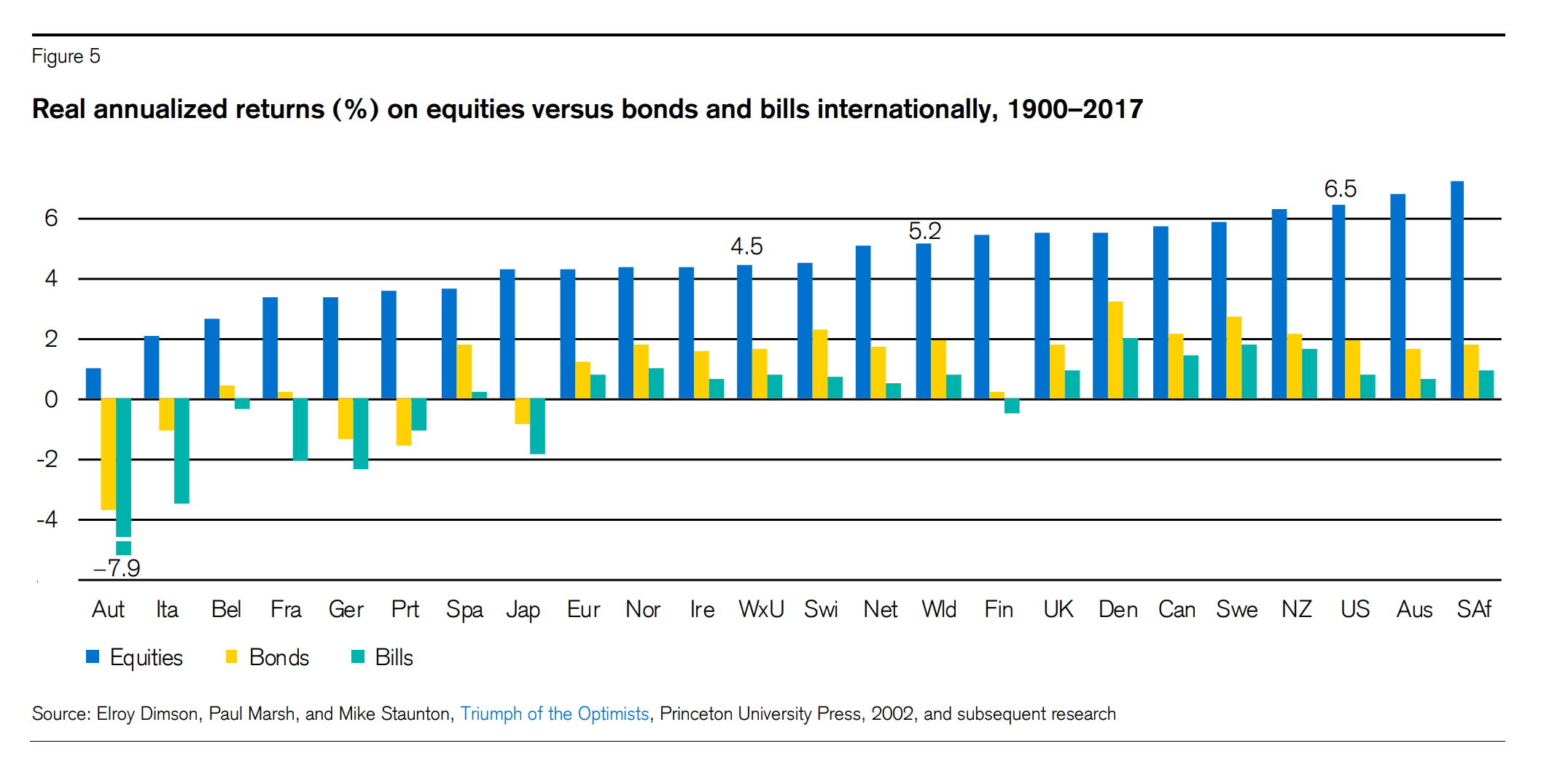
South African equity is the best performing, followed by Australia and of course, the US! Austria, Italy and Belgium are amongst the worst performing equity markets, in part due to the long-term impact of wars and hyperinflation on those countries.
‘The real equity return was positive in every location, typically at a level of 3% to 6% per year. Equities were the best-performing asset class everywhere. Furthermore, bonds beat bills in every country except Portugal. This overall pattern, of equities beating bonds and bonds beating bills, is precisely what we would expect over the long haul, since equities are riskier than bonds, while bonds are riskier than cash.’
But in case my friend Paul Lewis (of BBC MoneyBox) is reading, no, this doesn’t account for the impact of fees! Bite me!
[bctt tweet=”Between 1900 and 2017, the average real equity return was positive in every country, typically between 3% to 6% per year. But in case Paul Lewis (BBC MoneyBox) is reading, no, this doesn’t account for the impact of fees! Bite me!” username=”AbrahamOnMoney”]
#2 – Are the darkest times for the capital markets behind us?
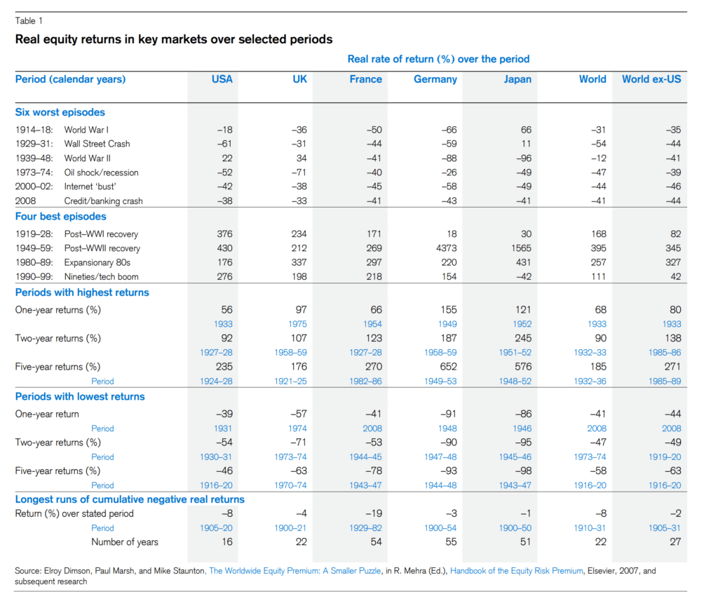
Notwithstanding the impressive performance, equity markets have experienced severe periods, particularly during wars and economic crises. The table below shows the real equity return during some of the best and worse market conditions since 1900.
Take this:
- During WWII, Japanese equities lost 96% in real terms; German equities lost 88%! In the eleven years that followed (1949-59), German equities returned a whopping 4373% in real terms. Japan did 1565% real return. If you didn’t bail on your investments during the War, you got rich or dead!
- UK equities lost 71% in real terms in 1973/74. In 1975, the real return was 97%!
- For 22 years between 1900-1921, the cumulative real return on UK equities was -4%! But if you think that’s bad, German equities recorded 55 years of negative real return between 1929 -1982! Good luck simulating that scenario with your deterministic/straight-line cashflow planning tool.
So what?
There’s a lot of talk about why today’s low bond yields and stretched equity valuations mean that future returns would be significantly lower than historical return. But the question is how bad do you expect it to be? Should we expect future returns to be worse than these severe scenarios? So, worse than WW1, WWII and the Great Depression?
The beauty of using extensive historical data to stress-test a retirement strategy is that you can see how the plan fares under a wide range of market conditions, including the most severe ones, and have a robust plan in place to make adjustments accordingly. But if worse market conditions than these do show up in the future, it’s hard to imagine what else anyone could do to mitigate the impact of 96%+ drawdown or more than 55 years of cumulative negative real return! Other than to diversify and hope for the best.
But if you really believe that the worst years are ahead for the capital markets, what’s the point in investing? Keep your money under the mattress. Buy gold. Build a bunker. Hope. Pray. Whatever.
[bctt tweet=”If you really believe that the worst years are ahead for the capital markets, what’s the point in investing? Keep your money under the mattress. Buy gold. Build a bunker. Hope. Pray.” username=”AbrahamOnMoney”]
#3 – Collecting or investing?
For the first time, the authors included an analysis of collectibles including rare books, stamps, books and classic cars.
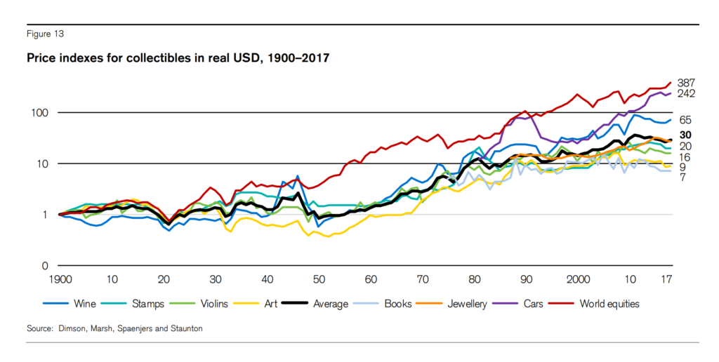
’Over the entire 118 years, the bold black line in Figure 13 shows that the average collectible rose 30-fold in terms of purchasing power. This is equivalent to an annualized price appreciation of 2.9%. Of the four collectibles for which we have 118 years of data (those incorporated in the average), wine performed best, with an annualized price appreciation of 3.7%, while art experienced the lowest price appreciation of just 1.9% per year. Long-run art returns were thus broadly in line with the real returns on a portfolio of global bonds (2.0% per annum). Figure 13 also shows the long run return, including reinvested dividends, on a global equity portfolio (5.2% per annum). Clearly, and not surprisingly, equities outperformed collectibles.’
#4 – Safe as houses?
Does it surprise you that for 50 years from 1900, house prices in most developed countries barely kept pace with inflation?
‘Prices started to rise in the 1950s, with an even stronger showing in the 1960s. However, the highest period of growth was from the mid1990s until the eve of the Global Financial Crisis, when real house prices rose by 6.2% per year!
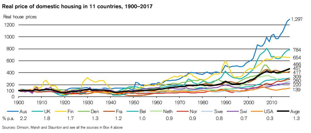
‘Australian house prices rose the most, growing by a factor of 13 in terms of local purchasing power, an annualized real return of 2.2%. US homes went up the least, rising by a factor of just 1.39 over the 118 years, an annualized, real USD return of just 0.3%. The heavy black line shows the average experience across the 11 countries, namely a mean annualized real return of 1.3%.’
It’s a bit unfair to compare house prices with total equity return because that comparison ignores rental yield for property investors or imputed rent for owner-occupiers. I expect the authors to revisit this in future publications.
Perhaps, above all, my main takeaway is that extensive empirical data provides the most objective perspective on the behaviour of asset classes. The data is fairly readily available. And there’s just no good excuse for failing to put this data to good use in financial planning.
[bctt tweet=”Extensive empirical historical data over the past 118 years provides the most objective perspective on the behaviour of asset classes. There’s no good excuse for failing to put it to good use in financial planning. ” username=”AbrahamOnMoney”]
.

Read Full Bio
Superb and thank you!